July 22, 2021, 0 Comments
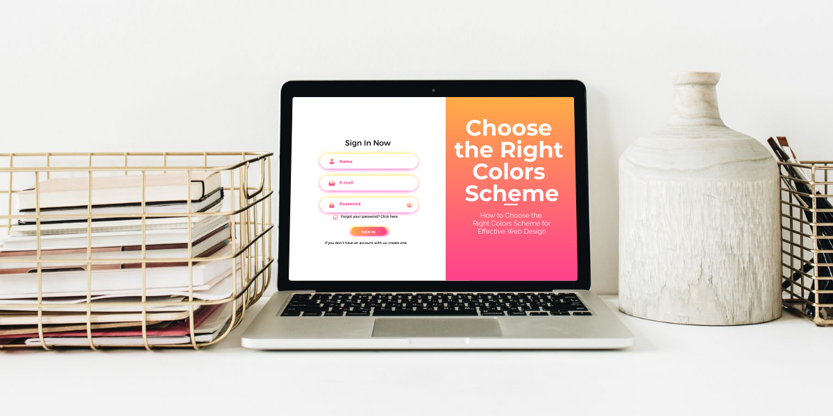
How to Choose the Right Colors Scheme for Effective Web Design
Do you remember visiting a site and being like “WOW”, this is a stunning site!!! A beautiful site consists of a well-put-together layout, the right fonts, and engaging pictures. Yet, another thing to consider is the color scheme. If you can get the colors right, you can project a professional and trustworthy image.
According to research, visitors can make a judgment about your site’s visual appeal in a matter of milliseconds!!! That’s a pretty short time to make a statement. About choosing the right colors for a website, logo etc, let’s find that out in this article but first, let’s see why it matters.
Why color scheme matter?
The color scheme represents your brand and the colors used in the logo should go well with your brand presence. Colors have a profound effect on:
- Sales
- Site visitors
- Time spent by visitors on the site
- Overall brand reputation.

You can influence customer actions like:
- Get more email subscriptions
- More purchases
- More Views
- Get more customers to contact you etc.
So Ya! Colors are really your weapon that can you take your brand where you desire it to be!!!
Effects of colors and how to use them
Now let’s see the effect of each color. Below are some colors and their influences on people.
Cool colors:
These colors appear soothing to the eye. These are light and calming in nature and induce feelings like:

- Dependability
- Professionalism
- Trust etc.
Walmart and American Express use blue colors to develop trust and to assure reliability. Subway uses green color to signify their ideology of “Eat Fresh”. Greens are a healthy choice and so the color scheme makes the public believe in Subway’s goals.
Warm colors:
These colors increase feelings that include:
- Happiness
- Passion
- Energy
Warm colors are loud and if you have noticed warm colors raise excitement and even feelings of hunger. For that reason brands like Burger King, KFC, and Hardee’s, etc. use red and yellow.
Choosing a color combination that works
Selecting a color scheme is a long complicated business. It’s very important so it should be done with care. Below are the steps you should take into consideration:

- Start from a primary color
After exploring different color options and how they affect your audience try to select one primary color for your business. Your logo and most of your branding material should have that primary color that would become your brand identity.
Use color psychology to choose a primary color. You can add more colors into the mix but a primary color should be in your mind.
- Spice it up
After you have selected your primary color you need to add a bit of flavor by adding different colors. Those colors can be lighter or darker shades of the primary color or colors from the far end of the color wheel.
Try to use bright colors for CTA (call to action) like the orange CTA used by Amazon. Use Adobe Color Wheel and choose the middle selector the same as your primary color. After that play around with other colors to see which looks the best with the primary color.
a) Add contrast
To add variety to your site, logo, branding material, etc. you can use complementary colors. These colors are opposite on the color wheel and contain different primary colors. These can be used for the background and for the content. You can put focus on the text with the contrast.
b) Analogous colors
These are colors that are close to each other on the color ramp. Usually, 3 colors adjacent to each other are used which give a pleasing feel. Sites related to nature or aesthetics use it to give a pretty and calming vibe.
c) Triadic colors
For such a combo 3 equally spaced colors are taken from the color wheel. So if you have a color ramp you will make 3 equal sections. You will pick one color from each section but the distance between each should be the same.
A triadic theme is considered a great option. With a triadic theme, you have one color for the background and two different colors for the content and other important sections.
Conclusion
A site that can keep the visitors hooked, proves to be much more successful than a site that looks dull. With the right colors, the reader will believe that you have put effort into your work and, so he will take your brand seriously.
Colors hold great value and can affect customer behavior thus giving them the share they deserve is important for brand success. Begin with a primary color and then use either, complementary, analogous, or triadic color combinations to add more interest.
Take your time, consult experts and then decide on colors for your logo, site, and brand material. Colors might seem simple but choosing the right colors that bring in customers is a tricky business.

Recent Comments